
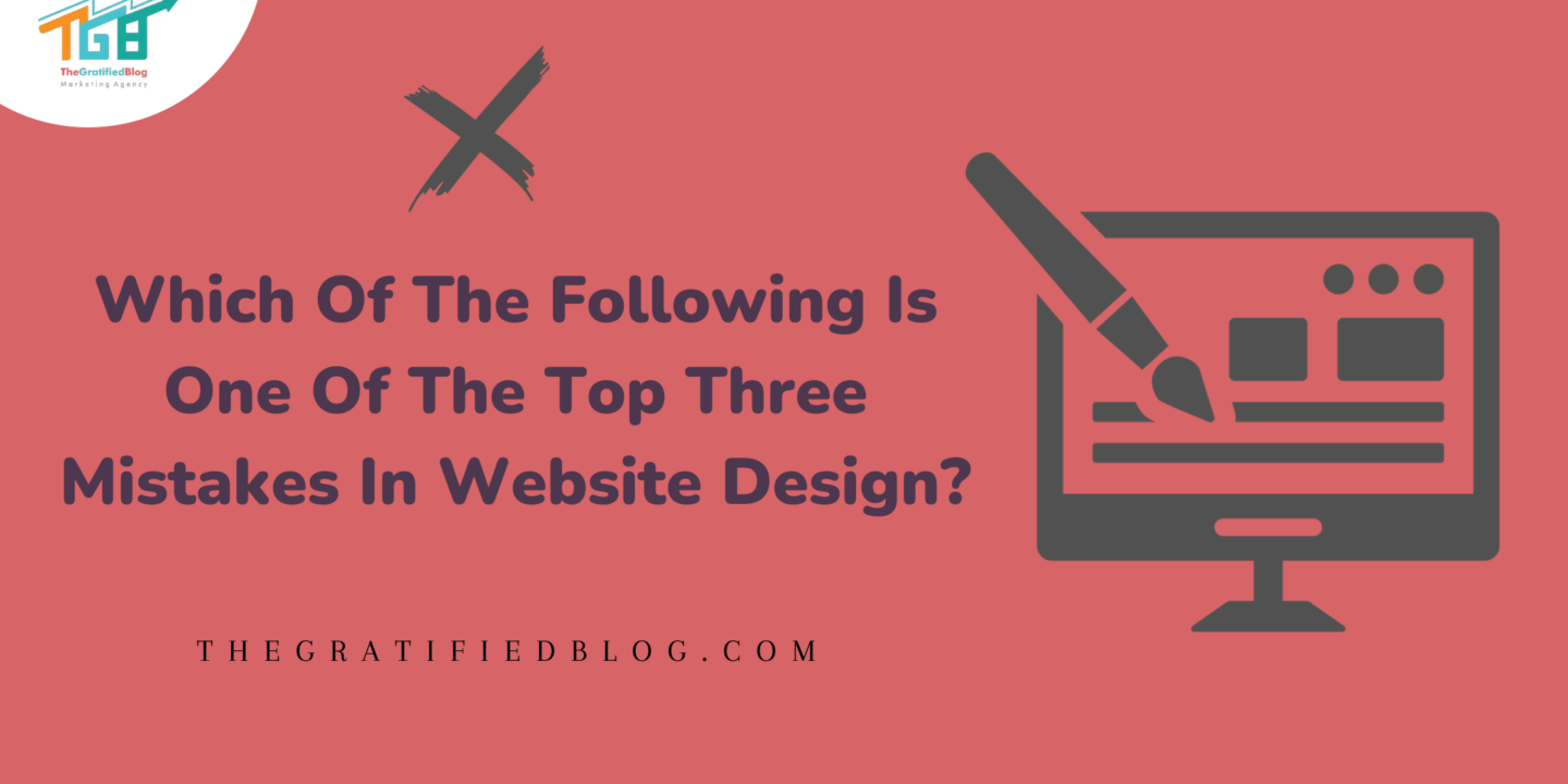
Website design is an art and science continuously evolving in the digital landscape. Your online presence is a pivotal factor that can determine success or failure. When crafting a successful website, one must tread carefully, steering clear of common pitfalls that can hinder your website’s effectiveness. So, let’s dive into the question: “Which of the following is one of the top three mistakes in website design?”
This blog will provide you with the answer and explore the three most critical mistakes that can impact your website’s performance and user experience. By the end of this journey, you’ll be equipped with valuable insights to ensure your website stands out for all the right reasons.
So, let’s get started:
Before we delve deeper into the subject, let’s answer the question.
Which Of The Following Is One Of The Top Three Mistakes In Website Design?
- Too much visual clutter
- Complicated wording
- Duplicate names
- Too many social media connections
The correct answer is “Too Much Visual Clutter.”
Now that we’ve uncovered the answer, let’s delve deeper into the response to gain a more comprehensive understanding.
Why Too Much Visual Clutter Is A Top Mistake?
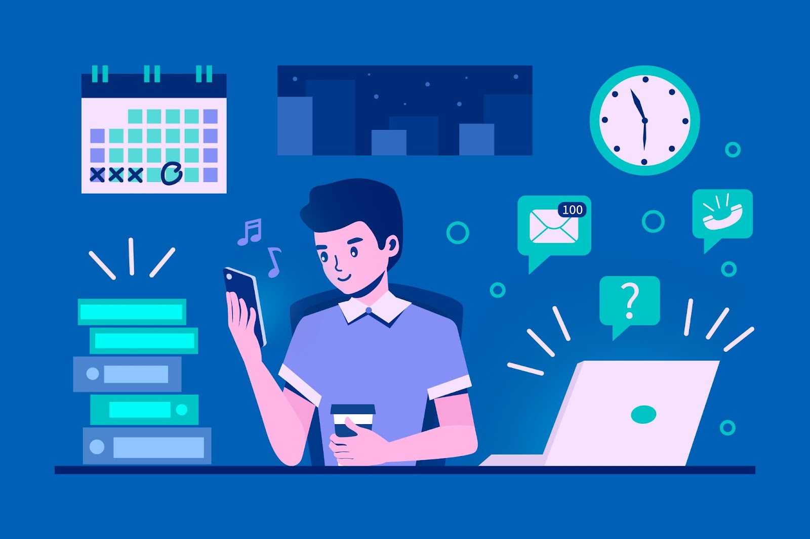
Your website’s design should be inviting, easy to navigate, and visually appealing. Unfortunately, one of the most common and detrimental mistakes is overwhelming visitors with too much visual clutter.
Visual clutter is characterized by an overwhelming abundance of elements like images, text, buttons, and graphics on a webpage. This excessive clutter can result in a myriad of problems that detrimentally affect both user experience and the overall effectiveness of the website. When a site is overloaded with elements, it becomes challenging for visitors to navigate and find relevant information, leading to confusion and frustration.
Overwhelming Visitors

A website filled with too much clutter can leave visitors feeling overwhelmed. When fewer elements are vying for attention on a webpage, it becomes easier for users to find the information they are seeking or take the desired actions. The result is often user frustration and, ultimately, a higher likelihood of them leaving the site.
This is a critical concern because a high bounce rate can adversely affect your website’s performance and ranking in search engines.
To mitigate this issue, creating a clean and organized layout is essential. Prioritize the most critical information and actions, and use white space to separate elements. White space provides visual breathing room and guides users’ eyes to what matters most. You can create a more user-friendly and less overwhelming experience by simplifying the design and ensuring a logical flow.
Slow Loading Times
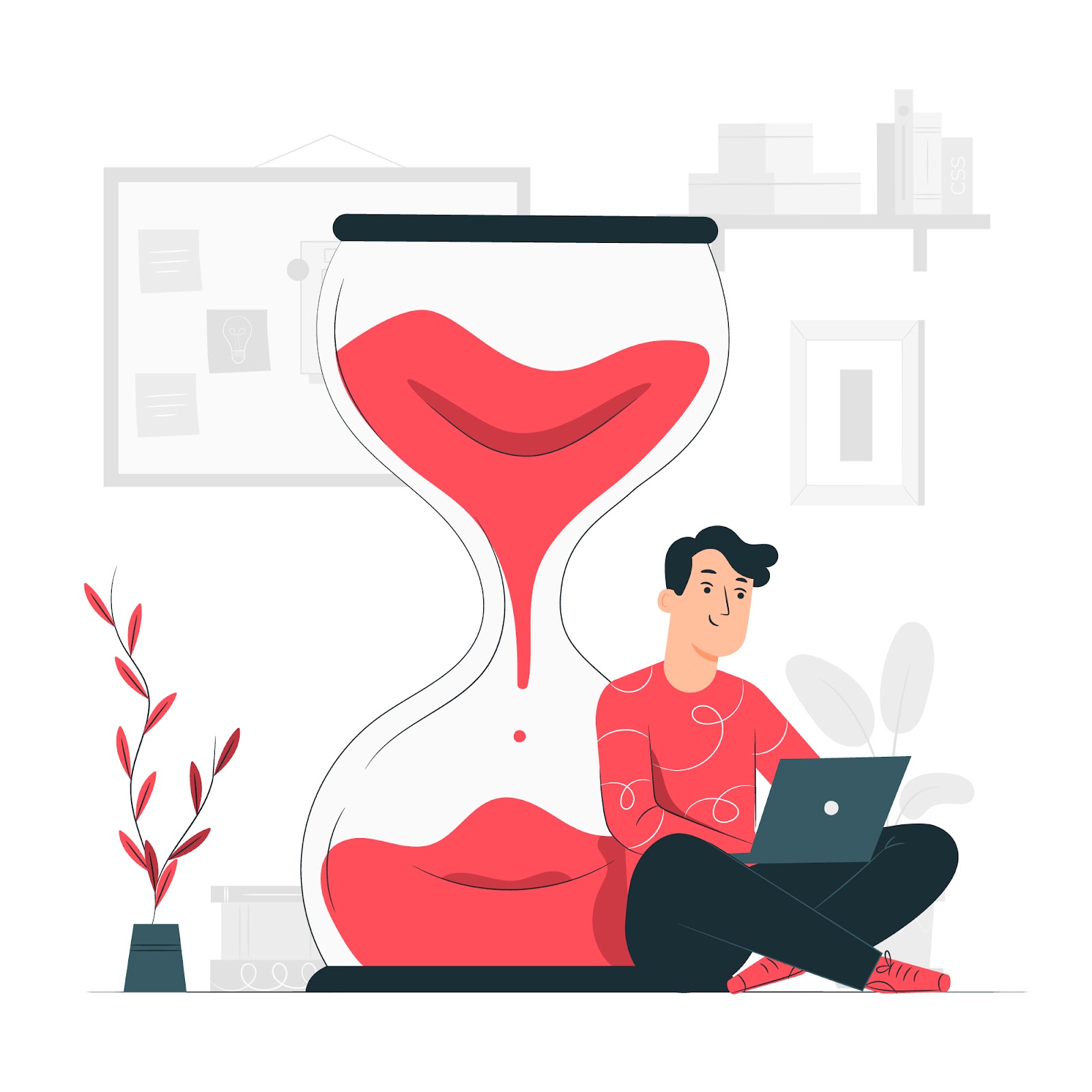
Visual clutter doesn’t just impact the user experience; it can also affect your website’s technical performance. A webpage cluttered with numerous images, scripts, and other resources tends to be heavier and, consequently, loads more slowly. In today’s fast-paced digital world, users have become increasingly impatient regarding website loading times.
High bounce rates can result from a website that loads slowly as users abandon sites that take too long to load. Moreover, search engines consider page speed a ranking factor, so a sluggish website can reduce visibility among potential users by diminishing your search engine rankings. Visitors.
To address this issue, consider optimizing your images and other media, minimizing unnecessary scripts, and employing content delivery networks (CDNs) to distribute your content efficiently. Reducing the amount of visual clutter and streamlining the design can significantly impact your website’s loading times.
Poor Mobile Experience

In the age of smartphones and tablets, mobile devices have taken the lead as the primary method for internet access. A cluttered website can be even more challenging, resulting in a subpar user experience on smaller screens due to navigation difficulties. Mobile experience. Mobile users have limited screen real estate, and excessive visual clutter can make it difficult to interact with your site effectively.
To ensure a positive mobile experience, it’s crucial to have a responsive web design that adapts to different screen sizes. This design approach ensures your website looks and functions well on various devices.
Additionally, optimizing the mobile version of your site for speed is paramount, as mobile users are often on the go and expect quick access to information. Streamlining your design, reducing visual clutter, and prioritizing essential content and actions on the mobile version of your site can significantly enhance the user experience for your mobile audience.
Decreased Conversion Rates

The cluttered design of a website can significantly impact conversion rates. Whether your goal is to sell products, capture leads, or encourage specific actions like signing up for a newsletter, a cluttered website can deter users from taking these actions. When visitors are bombarded with too much information, they may become overwhelmed and unable to focus on the desired conversion goal.
To improve conversion rates, you should maintain a straightforward, focused design that guides users toward the desired actions. Highlight key call-to-action buttons, provide specific instructions, and minimize distractions. A clutter-free design ensures visitors can quickly and easily understand what you want them to do, Enhancing the chances that they will complete the intended actions. Actions.
Brand Perception
Your website’s design reflects your brand’s image, and a cluttered design can convey a sense of disorganization and unprofessionalism. The visual clutter can make visitors perceive your brand negatively, potentially turning away potential customers or clients.
Maintaining a clean and organized website design is vital for a positive brand perception.
It showcases professionalism, meticulousness, and a dedication to providing a user-friendly experience.
When visitors perceive your brand as trustworthy and credible, they are more likely to engage with your content, products, or services. Therefore, ensuring a clutter-free design is about improving the user experience and enhancing your brand’s image and credibility.
Now that we’ve established why too much visual clutter is a significant website design mistake, let’s explore two other common blunders that can harm your website’s success.
Complicated Wording
Although too much visual clutter relates to the layout and elements of a webpage, employing complex language is a significant content-related mistake in website design. Your website’s content should be straightforward, concise, and easily understandable. Complicated wording can lead to various adverse outcomes:
Confusion
When your website employs simple wording, it can lead to clarity among visitors. The use of jargon, technical terms, or convoluted language can make it challenging for users to fully grasp the message you’re trying to convey. This can result in frustration as visitors struggle to understand your website’s content or purpose.
Confusion can be a significant deterrent, causing users to abandon your site, as they need help finding the information they seek or understanding the value you offer. To avoid this, it’s crucial to prioritize clarity and simplicity in your content, ensuring your message is easily understandable to a broad audience.
Inaccessibility
Complex language can create a barrier for individuals with limited English proficiency or cognitive disabilities, making your website less inclusive. It’s important to remember that your website’s audience may include people with diverse linguistic backgrounds and varying levels of cognitive abilities.
Complicated language can alienate those who need to be more fluent in the language or need help understanding complex terminology. Ensuring inclusivity using plain, straightforward language allows a broader range of people to access and engage with your website’s content, thus increasing its effectiveness and impact.
High Bounce Rates
Due to complicated language, users are more likely to bounce and seek information elsewhere if they need help finding the information they’re looking for. High bounce rates are detrimental to your website’s performance and goals. Users’ attention spans online could be faster, and they expect to find information quickly and efficiently.
If they encounter complicated language that hinders their ability to navigate or comprehend your content, they will likely leave your site in frustration, increasing bounce rates. To retain visitors and keep them engaged, it’s essential to present information clearly and concisely, making it easily accessible and understandable. This can lead to longer dwell times, improved user satisfaction, and a higher likelihood of achieving your website’s objectives.
To avoid this mistake, aim for simplicity and clarity in your content. Use plain language that your target audience can easily comprehend. Additionally, consider employing formatting techniques like bullet points, headings, and concise paragraphs to enhance readability.
Too Many Social Media Connections
While social media integration can be a valuable aspect of your website, overloading your site with too many social media connections is another common mistake. A few well-placed social media icons and links can prompt visitors to engage with your brand. Various platforms. However, an excess of social media connections can have adverse consequences:
Distraction
A website’s many social media icons, links, and buttons can easily distract visitors from its primary content and goals. Users may become overwhelmed by the plethora of social media options, leading them to lose focus on the content and actions you want them to engage with.
This can dilute the effectiveness of your website, as visitors are less likely to convert or complete desired actions when they are drawn away from your core message. To maintain a clear and focused user experience, it’s essential to balance offering social media connections and ensuring they stay within your website’s primary content and objectives.
Slow Loading Times
Each social media connection often comes with additional scripts and resources that can significantly contribute to slower loading times for your website. The more social media icons, widgets, or plugins you incorporate, the more data your site needs to load from external sources, leading to sluggish performance.
Slow-loading websites frustrate users and can result in higher bounce rates, as people tend to abandon sites that take too long to load. To mitigate this issue, consider carefully selecting the social media connections that are most relevant to your audience and business goals.
Additionally, optimize the loading of these social media resources to ensure they don’t impede your website’s performance and user experience.
Privacy Concerns

Users may be wary of websites that appear overly eager to collect personal information or connect to social media profiles. When websites feature fewer social media connections, visitors may become concerned about privacy and data security.
They may worry that these connections are being used to track their online behavior or that their personal information is being shared without their consent. To address privacy concerns, it’s essential to be transparent about the purpose of social media connections on your site and assure users that their data is handled securely and in compliance with applicable privacy regulations. Building trust can help alleviate privacy concerns and motivate users to interact with your social media—connections without hesitation.
Consider which social media connections are most relevant to your audience and business objectives to avoid this mistake. Display them strategically, ensuring they complement your content rather than overpower it.
Conclusion
Now that we’ve identified which of the following is one of the top three mistakes in website design? It’s essential to avoid these errors to protect your business from harm. Take proactive steps today to steer clear of these mistakes and witness how they can expedite customer conversions significantly.
If you still have any questions related to the blog, then feel free to leave them in the comment section. We will be happy to answer you.
Thanks for reading 🙂


No Comments