
Every hotel that wants to look professional and welcoming needs to have a website. It is not just a webpage where you give out basic information; its appearance and optimization are essential in attracting new guests.
Most people nowadays don’t make reservations over the phone, but instead, use the internet to check out what’s out there and, of course, book accommodation. That is where the business website design plays a significant role in the visitors’ decision-making.
This article discusses further reasons you should create a proper design for your hotel’s website and consider it during the design process.
Why Do You Need a Good Design For Your Hotel Business?
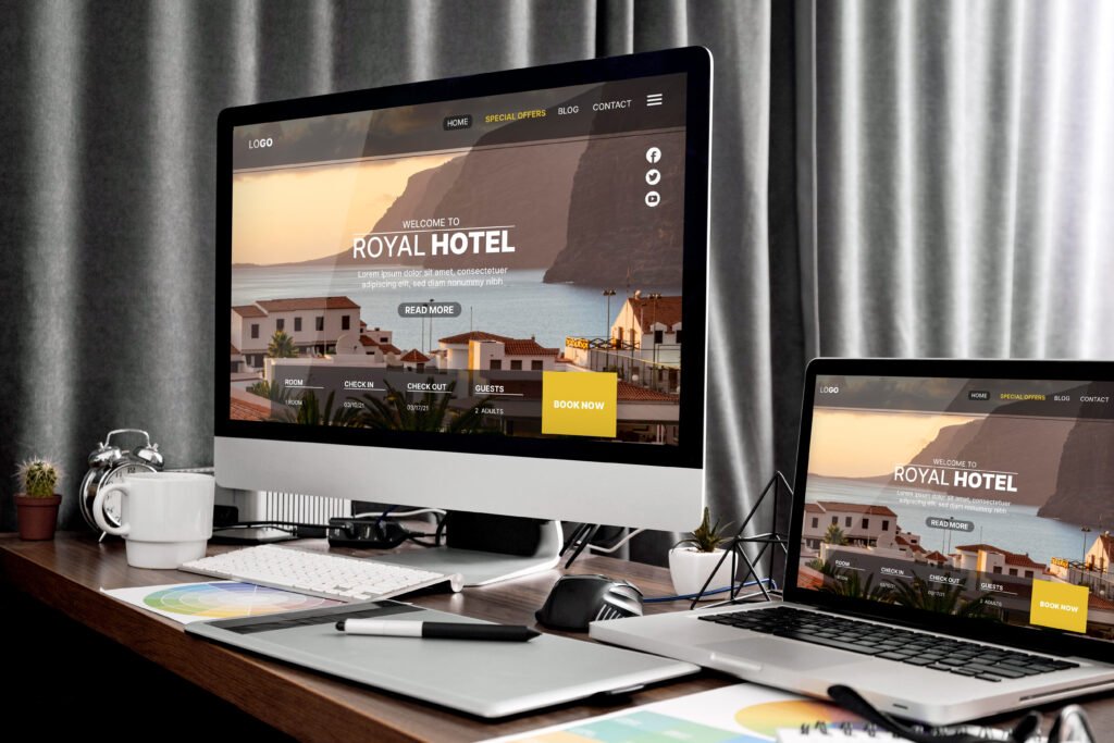
Your hotel’s webpage can significantly influence whether your potential guests want to stay at your establishment or keep looking for something more suitable. Here are some main reasons why its design significantly influences your business.
Your Website Also Showcases Your Brand
You want the public to know your business; creating a solid brand image is the way. A good design will help you reach as many people as possible, increasing conversions and better website traffic.
It should also display your trademark that connects to your hotel’s values and vision. This can be achieved using graphical elements such as colors, images, and text fonts that will make a particular impression on the website’s visitors.
To sum up, your website must be visually appealing to your guests.
It Provides All Of The Necessary Information
Naturally, your future guests will visit your website to learn more about pricing, the accommodation you offer, restaurant menu options, etc.
Therefore, your hotel website design needs to have all of the necessary information displayed and updated if there are some changes in hotel management. It should also have space for announcements, special offers, etc.
The information needs to be well-organized in different sections so your customers don’t get confused and leave the page before even considering booking their stay.
It Can Function As An Excellent Marketing Tool
The website can help you understand who your target audience is. Apart from your price range and website appearance, your visitors decide if they want to stay in your hotel based on your offer.
Checking your Google Analytics will tell you how long they stayed on your website, their geographical location, and what they were looking for on the internet. With this information, you will know how to market yourself and attract the right customers.
Now – How Do You Make A Quality Business Website Design?
There are several things you want to think about when designing your website. Not only should it look appealing to the eye, but it should also make your visitors interact with it. It creates more conversions and brings more traffic and visitors to your website.
Use Visuals To Your Advantage

Don’t underestimate the power of quality photography, fantastic typography, and excitement. The front page should include stunning imagery inviting website visitors to learn more about you.
The colors you pick will tell more about you to your customers. Consider using vibrant colors or cool, calming ones, depending on what impression you are trying to make. Make sure you don’t go overboard and make it look too distracting.
It’s expected that your potential guests would want to see your hotel’s exterior and interior hotel. Ensure you include a picture of the restaurant, rooms, bathroom, etc., so they know what to expect after booking their stay.
Make A Call-To-Action Option
A call-to-action (CTA) is essential in every business website as it allows customers to interact with you virtually. A good call-to-action option should always grab your customer’s attention.
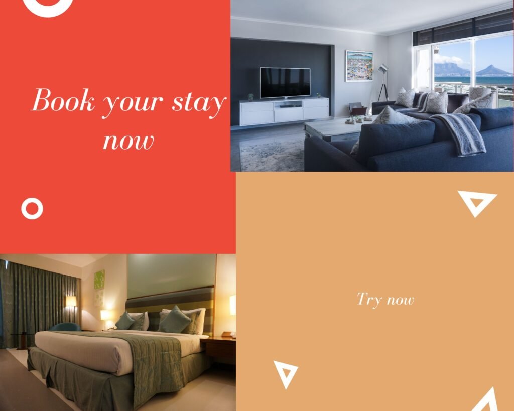
A CTA can be clickable, such as a button, link, image, banner, or text that invites visitors to interact. The action doesn’t have to be just booking rooms but also subscribing to a newsletter, searching for contact information, etc.
To create a compelling CTA, the text inside it should be short and straightforward, even demanding sometimes. It has to direct the website visitors to the vital elements of your website. Some common phrases used in CTAs are:
- Add to cart
- Book your stay now
- Read more
- Subscribe to our newsletter
- Contact us
- Try now
CTAs should be placed to catch the website visitor’s attention first. This includes pop-ups, hero images, paragraphs, etc.
The CTAs on your website should also look different than the rest of the website’s content. Your future will likely miss them if they are the same color and text font.
Sometimes, your visitors might not engage with the primary CTA simply because they are unsure if they want to commit or explore more options you give them. That’s why your website should also have a secondary CTA.
With the secondary CTA, there is a higher chance of visitors’ engagement until they are ready to take some action. However, it shouldn’t be a copy of the primary one, as it can easily confuse your visitors. It should serve a different purpose and be located on some other part of the webpage.
Online Booking Should Be Easy
A user-friendly online booking should improve user experience and increase your website’s conversions. By user-friendly, we mean the website provides clear instructions and is transparent, so your guests are not surprised by extra charges if there are any.
The Hotel’s Webpage Should Be Responsive

The last thing you want is to lose potential guests because your website didn’t load or looked unprofessional and unorganized. That is solvable by designing a responsive business website today, which is essential in creating any website.
Since mobile devices have taken over the world, you want your website to be easily navigated through them, just like on desktops. A responsive website means it is adapted across different devices and their display sizes without losing any of its content. The same goes for tablets as well.
Another thing you want to be aware of is the website’s loading time. Responsive webpages load faster, which means you want to make your website’s visitors turn into customers. If it takes too long to load, they will quickly lose patience and more to other businesses’ websites.
Create A Good SEO Strategy
Another essential thing to consider to increase the website’s traffic is its search engine optimization (SEO). It helps you get on the top of the search results, which is crucial when you know most people rarely check the second page, let alone the third.
Your webpage’s content should have keywords to boost it to the top of the search engine result pages. The right keywords should be those that your potential website visitors will type in their search engine.
Ensure you don’t just focus on hotel-related terms visitors are less likely to look for. It’s better to combine them with other notions, like the place/city you are located in.
More Reads – Web Design And SEO: A Strategy to Outrank Your Competitors
Highlight Your Amenities With A Separate Page
It’s not enough to just put your amenities inside a text or a paragraph on a single page with the rest of the information. Instead, create a separate webpage where you emphasize the benefits your guests get after booking a stay with you.
Include Customers’ Testimonials Into Your Webpage

You can’t ignore the power of a good review since most people learn about hotels through other people. With good testimonials, your website’s visitors will become tour guests if they can trust you.
Use A Hotel Website Builder

If you want a quick and effective solution for creating your website, a hotel website builder is just a thing for you. Creating and updating your business website is easy. It is much faster since it doesn’t require knowledge as it already contains well-structured HTML and CSS codes.
It also includes website templates, HTTPS security, optimized images, etc. Speaking of optimization, SEO will boost your rankings.
More Reads – 10 Best Web Design Tools That Will Take Your Site To The Next Level
What Are The Examples Of The Best Hotel Website Design?
Whether you’re seeking inspiration for your hotel website or simply appreciating exceptional design, these examples will showcase the art of creating captivating digital spaces for the hospitality industry.
- The Fontaine
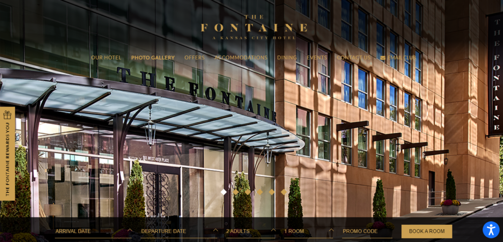
This luxury hotel website uses elegant design with stunning, captivating visitors. Immediately, using large, high-quality images and minimalistic layouts creates a sense of luxury and sophistication. The website’s navigation is intuitive, and the information about rooms, dining, and amenities is engaging and visually appealing.
- 1 Hotel South Beach
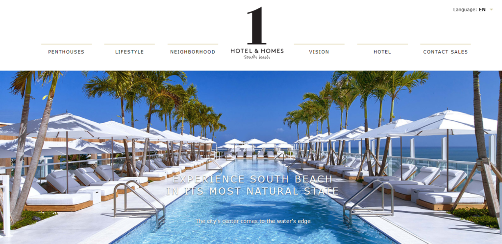
The 1 Hotel South Beach website incorporates a modern and environmentally conscious design. It features a seamless blend of beautiful imagery, subtle animations, and an earthy color palette. The site effectively showcases the hotel’s commitment to sustainability while providing clear information about accommodations, dining options, and activities. The design reflects the hotel’s eco-friendly ethos.
- The Hoxton
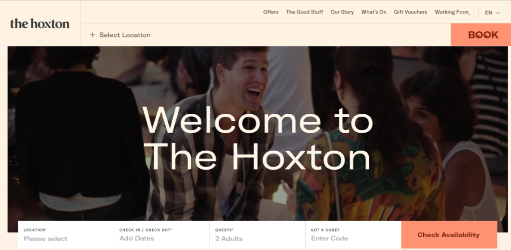
The Hoxton Hotel website impresses with its trendy and vibrant Usinge use of bold colors, playful typography, and eye-catching illustrations, creating a youthful and energetic atmosphere. The website offers a seamless booking experience, provides information about the hotel’s various locations, and highlights its unique offerings, such as co-working spaces and events.
- Ace Hotel
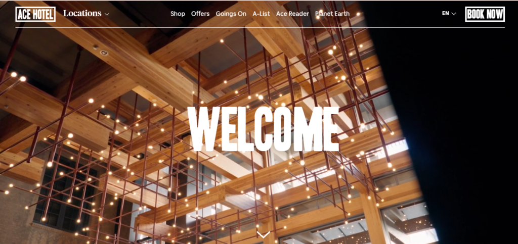
The Ace Hotel website stands out with its edgy and unconventional design. It embraces a retro aesthetic with vintage-inspired visuals and quirky illustrations. The site features a dynamic layout that showcases the hotel’s urban vibe and promotes its cultural events and collaborations. The intuitive navigation and immersive storytelling make for an engaging user experience.
- Aman Resorts

Aman Resorts’ website exudes luxury and tranquility through its elegant and minimalist design. Using ample white space, stunning imagery, and subtle animations creates a sense of serenity. The site showcases the beauty of each destination, provides detailed information about accommodations and wellness experiences, and allows users to explore the unique offerings of each resort.
Conclusion
A well-designed business website is a crucial asset for any company. It acts as a digital storefront, representing the brand and engaging customers online. A successful business website design includes a clean and intuitive layout, visually appealing graphics, easy navigation, and compelling content.
If you encounter any challenges while creating inquiries about your website, kindly post your questions in the comment section below. Our team is here to assist you and provide answers to any inquiries you may have. Your satisfaction is our priority, and we are eager to help you achieve your website goals.
Also, Read – How To Create A Website From Scratch: A Guide For 2023
– Static Vs. Dynamic Website: What’s The Difference To Know?–
Website Redesign: Does Your Website Need It?





No Comments