Email mockup design is pivotal for email marketing success. This guide delves into email mockups, their significance, and effective creation strategies. We’ll dissect vital components, suggest essential tools, and highlight best practices, real-world case studies, and pitfalls to avoid.
Mastering its art of design will amplify your campaign’s impact and engagement, ensuring your emails stand out in a cluttered inbox.
Elevating your design game will lead to higher click-through rates, conversions, and a more substantial ROI. Stay tuned to discover its secrets of crafting compelling content that drives results in the competitive digital marketing landscape.
What Is Email Mockup?

It is a visual representation or design prototype of an email marketing campaign before sending it to recipients. It serves as a preview or blueprint, allowing marketers to see how their email will appear to subscribers.
These are essential because they help ensure design consistency, enhance collaboration among team members, and reduce the need for revisions.
These critical elements include header/footer design, content layout, typography, and imagery. When creating email mockups, choosing the right design tools, following a step-by-step process, and optimizing for mobile responsiveness are crucial.
Best practices include adhering to brand colors, strategic CTA placement, and accessibility considerations.
Testing and validation ensure compatibility across email clients and devices, while case studies and avoiding common mistakes further improve the effectiveness of email marketing mockup PSDs.
Benefits Of Email Mockups
Improving Design Consistency

It guarantees a uniform and polished appearance throughout diverse campaigns, enhancing design consistency.
They provide a visual framework, like an email mockup vector or an email template mockup PSD, for assessing layout, fonts, and branding elements.
That ensures your emails convey a cohesive and professional image to your recipients. By using mockups, you can streamline the design process and minimize errors, ultimately boosting the impact of your email marketing efforts.
It is crucial in maintaining design consistency and enhancing your email marketing strategy.
Enhancing Collaboration
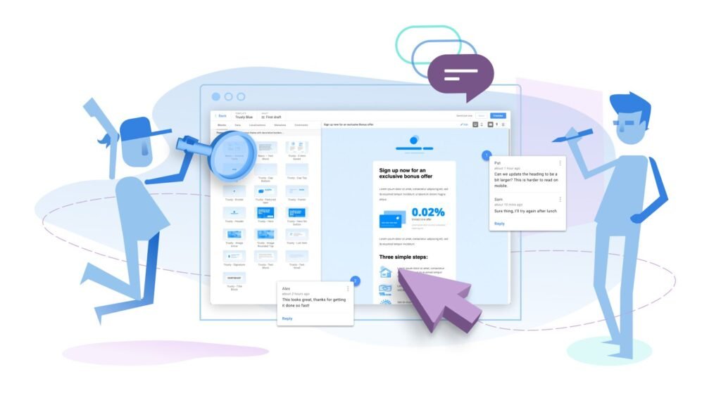
Mockups facilitate alignment among designers, content creators, and stakeholders. They serve as visual blueprints, promoting a shared understanding of project goals.
Through collaborative feedback and iterations, teams refine ideas effectively. This synergy reduces misunderstandings and accelerates project progress.
Ultimately, mockups empower teams to deliver cohesive and successful outcomes.
Minimizing Revisions

Visualizing the design early on minimizes the need for extensive revisions, saving time in email creation. This proactive approach ensures a smoother workflow and fewer disruptions during the project.
It enhances collaboration as stakeholders can provide feedback early, preventing significant changes later.
Ultimately, this streamlined process leads to more efficient and effective email campaigns. So, prioritize design visualization to minimize revisions and maximize productivity.
Critical Elements Of Email Mockups
Here are the key elements:
- Header and Footer Design: Craft a compelling header that showcases your branding elements. Create a footer with vital contact details and user-friendly unsubscribe links, ensuring a seamless and professional user experience.
- Body Content Layout: Arrange text, images, and content strategically for reader engagement. Use a clear hierarchy, concise paragraphs, and appealing visuals to enhance readability. Ensure a mobile-responsive design for a seamless experience. Test and refine the layout to optimize your email’s impact.
- Typography and Fonts: Choose brand-aligned fonts for legibility on all devices. Consistency is vital; select typefaces that reflect your identity. Maintain readability in both print and digital mediums. Your typography sets the tone for your message.
- Imagery and Graphics: Enhance your message’s appeal with captivating visuals. Engage your audience through relevant images and graphics, creating an enticing experience. These visuals will complement your message and leave a lasting impression. Elevate your communication with compelling visual elements.
Creating Email Mockups
- Choosing the Right Tools: Consider your workflow and needs when selecting the right design tools. Popular options are Adobe XD, Sketch, or dedicated email design platforms. Assess their features, user-friendliness, and compatibility with your requirements team. Ensure the chosen tool supports responsive design for mobile and desktop. Ultimately, pick the one that enhances your email design process and productivity.
- Step-by-Step Mockup Design Process: Follow a structured process, starting with wireframing, creating a layout, adding content and visuals, and refining the design iteratively.
- Tips for Mobile Responsiveness: Ensure your email layout adapts to different devices and screen dimensions, and conduct testing and adjustments to deliver a smooth user experience.
Best Practices For Email Mockup Design
Color Palette And Branding

Maintain a consistent color palette to establish brand recognition. This palette should reflect your brand identity and values, creating a visual language for your audience.
Ensure these colors are used consistently across all marketing materials, from your website to packaging.
Consistency reinforces your brand’s identity in the minds of consumers, making it easier for them to recognize and trust your products or services. Your color palette becomes a powerful tool for building a solid and memorable brand.
Call-To-Action (CTA) Placement

Strategically position CTAs to guide recipients towards desired actions, making them prominent and compelling. Ensure they stand out within your content, preferably above the fold.
Use persuasive language and contrasting colors to draw attention. Test different placements and styles to optimize conversion rates.
Remember, a compelling CTA can be the key to driving user engagement and achieving your goals.
Accessibility Considerations

Considerations for Accessibility: Design focuses on Enhancing accessibility by incorporating alt text for images and ensuring text is legible for all users.
Provide keyboard navigation options to accommodate those with motor disabilities. Implement ARIA landmarks for screen reader users to navigate your content easily.
Ensure sufficient color contrast for users with visual impairments. Regularly test your website or app with accessibility tools to identify and address any issues.
Testing And Validation
- Ensuring Compatibility with Email Clients: Test your email mockups across various email clients to guarantee they display correctly and consistently.
- We are conducting A/B Testing with Mockups: Employ A/B testing to compare various versions and ascertain which yields the best engagement and conversion results.
Email Mockup Tools
- Overview of Popular Mockup Tools: Explore popular email mockup tools like Litmus, Email on Acid, and Email Uplers, each offering unique features for designing and testing.
- Features and Benefits Comparison: Compare the features and benefits of these tools to make an informed choice that suits your email marketing needs.
Common Mistakes To Avoid
Design Overload

Avoid cluttering it with excessive visuals or information, which can overwhelm recipients. Maintain a clean and minimalist design for better user engagement.
Prioritize essential content and maintain a clear visual hierarchy. Utilize whitespace efficiently to establish a harmonious and digestible layout. Remember, simplicity often leads to more impactful email designs.
Ignoring Responsive Design

Neglecting mobile responsiveness can harm user experience, risking engagement loss. This oversight impacts website credibility and user satisfaction.
In an increasingly mobile-centric world, businesses must adapt to varying screen sizes for success. Prioritizing mobile responsiveness is essential for retaining and attracting users.
Neglecting Accessibility

Overlooked accessibility features can alienate a portion of your audience, so ensure your mockups are inclusive.
This proactive approach broadens your user base and aligns with ethical design principles. Prioritize features like alt text for images and keyboard navigation, making your product usable for everyone.
By fostering inclusivity, you enhance user satisfaction and compliance with accessibility regulations, ultimately improving your brand’s reputation. Don’t underestimate the power of accessible design in today’s diverse digital landscape.
Conclusion
Email mockup design is a fundamental aspect of successful email marketing campaigns.
You can create visually appealing and practical designs that enhance your email marketing efforts by understanding the importance of mastering key elements, using the right tools, and following best practices.
Remember to continually test, iterate, and stay updated with the latest design trends to improve your email campaigns.




No Comments